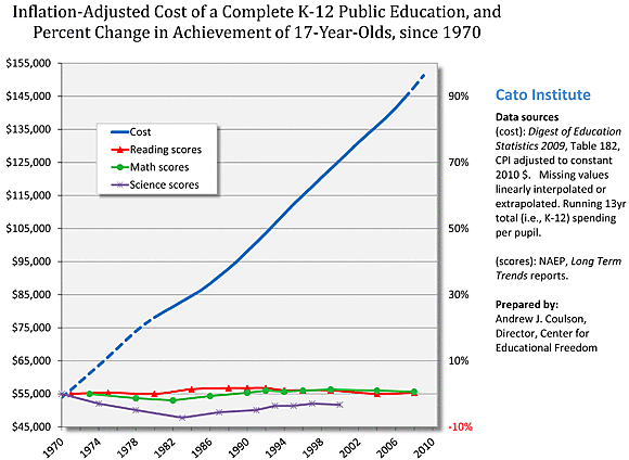
Education professor Sherman Dorn imagines foul play and education policy maven Matthew Ladner is withholding judgment for the time being. Ladner recently made use of some of my charts of the public school productivity collapse, and Dorn has taken issue with one of them, depicted below [from my February 2011 testimony to the House Education and the Workforce Committee].
Actually, the earlier version of the chart Ladner used really did have some incorrect data in the first decade of the spending series [yes, even people who worked at Microsoft sometimes mess up cut and paste], but the corrected February 2011 version also shows the roughly tripling in cost to which Dorn objected, so he would presumably still hold to those objections. Here they are:
First, once I looked at Table 182 from the 2009 Digest of Educational Statistics, it became clear that the cost figure increases (supposedly the total cost of a K‑12 education taken by multiplying per-pupil costs by 13) are false. If you look at the columns in the linked data (Table 182), the per-pupil costs when adjusted for inflation approximately double rather than triple as asserted in this figure. Second, there is no possible source for the approximate “0%” line from NAEP long-term trends data, unless there is an additional calculation unexplained by Coulson.
As described in its legend and title, this chart presents the “running 13-yr (K‑12) total spending per pupil” to arrive at the “cost of a k‑12 public education” in constant, inflation-adjusted 2010 dollars. For those unfamiliar with the concept of a running total, here’s Wikipedia’s explanation. So for a student graduating in 2009, the running total cost of k‑12 education is the sum of average per-pupil spending in 2009 and the preceding 12 years. It is, put another way, the average cost of having sent a child through the public school system, from k through 12. Dorn’s notion that a running total can be calculated by simply multiplying a number by a constant is mistaken, and that seems to be the source of his confusion.
For the class of 2009, the running total adds up to a little over $151,000, which is the final data point making up the blue spending line above. The rest of that line is made up of the corresponding running totals for the preceding years—each one the sum of spending for that year and its preceding 12 years (interpolating missing year data, as noted in the legend).
As for the academic achievement data series, the chart indicates that they represent the “percent change in the performance of 17-year-olds” on the “NAEP Long Term Trends” tests. I’m not sure what difficulty Dorn has with this, since calculating the percent change from an old value to a new one is straightforward. For example, the Long Term Trends NAEP reading score for 17-year-olds in 2008 was 286, and the corresponding score in the first year tested was 285. So the percent change to year 2008 = (286 — 285) / 285 = 0.0035 = 0.35 percent. That is the last data point in the green series in the chart above.
If he’d bothered to ask, I would have been just as happy to explain this to Dorn privately as I am to do so publicly.

