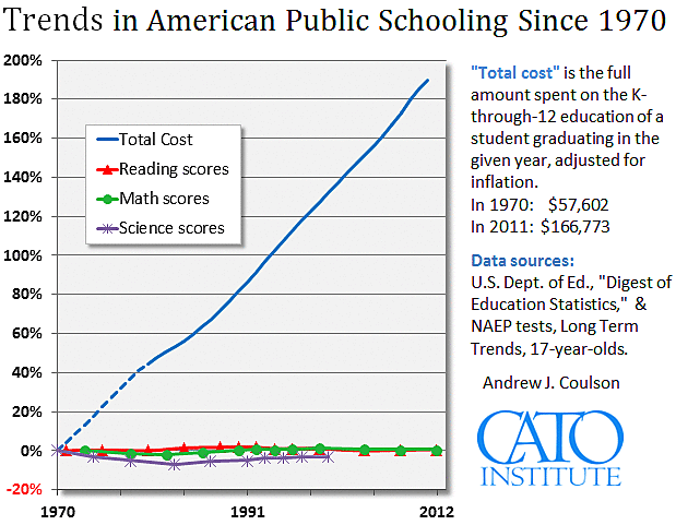
For the past few years I have charted the trends in American education spending and performance (see below). The goal is to see what the national data suggest about the productivity of our education system over time. Clearly, these data suggest that our educational productivity has collapsed: the inflation-adjusted cost of sending a student all the way through the K‑12 system has almost tripled while test scores near the end of high-school remain largely unchanged. Put another way, per-pupil spending and achievement are not obviously correlated.
Not everyone is happy with these charts, and in this post I’ll respond to the critics, starting with the most recent: Matt DiCarlo of the Albert Shanker Institute, an organization that honors the life and legacy of the late president of the American Federation of Teachers. DiCarlo finds the chart “misleading,” “exasperating,” and seemingly designed to “start a conversation by ending it.” Since we’re actually having a conversation about the chart and what it shows, and since I’ve had countless such conversations over the years, perhaps we can agree that the last of those accusations is more of a rhetorical flourish than a serious argument.
DiCarlo links to a couple of earlier critics to do the heavy lifting in support of his antipathy, but he does admonish the use of a single percent-change y‑axis as “not appropriate for and totally obscur[ing] changes in NAEP scale scores.” This is ironic. When I first began to publish these charts, I used two separate y‑axes, as shown in the image below which dates back to around 2009.
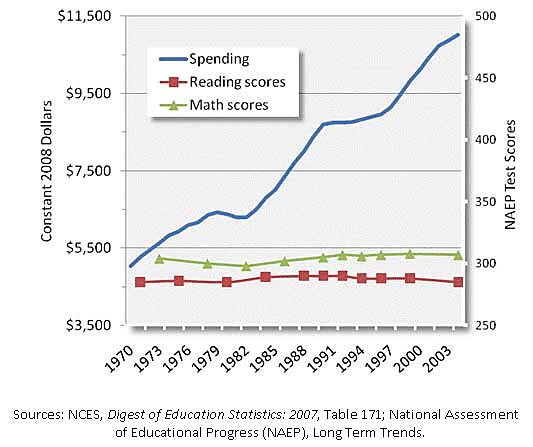
This, DiCarlo may be exasperated to hear, was roundly critized for the ostensible crime of using… 2 separate y‑axes, which, apparently, is only done by knaves and charlatans according to several e‑mails I received at the time. But of course the use of 2 separate y axes is not inherently misleading. It depends on why they are used, whether or not the scales are sensible, etc. But when you are trying to reach a suspicious audience, it’s not very effective to just say: “no, you’re mistaken, there’s nothing wrong with this use of 2 y‑axes.” They’ll just put that down to more knavery on your part. So, thinking I would eliminate one source of spurious objections, I switched to a single percent-change axis. And now we have DiCarlo’s objection to that. Catch-22.
But let’s investigate DiCarlo’s criticism. Does the percent change scale obscure important changes in the NAEP scores? Looking at the first chart, it is easy to see that the science score fell and never quite recovered to its original level before the test was discontinued, while the reading and math scores seem largely unchanged. As it happens, the raw NAEP score for math rose from 304 to 306, while the raw reading score rose from 285 to 287, and the raw science score fell from 305 to 295. We can see the science decline quite clearly, so it hasn’t been obscured. But the two-point gains in math and reading look essentially like flat lines. Which raises the question: is a two point gain essentially equivalent to a flat line, or is it substantial?
Some people like to answer that question by saying that a gain of x points on the NAEP is equivalent to one school-year’s worth of learning. But, according to a 2012 paper commissioned by the NAEP Validity Studies Panel, claims of that sort are unempirical guesswork.
Fortunately, there is a tried-and-true metric that researchers use to quantify effect sizes: they express them in terms of standard deviations, and those measures can in turn be converted to percentile scores. For example, the earliest available std deviation for the mean reading score of 17-year-olds was 46 points. Dividing 2 by 46, we get an effect size of 0.0435 SDs. That would take you from being in the middle of the pack in the early 1970s (that is, the 50th percentile), to being at the 51.7thpercentile. So instead of outscoring half your peers, you’d outscore 51.7 percent of them. That’s not a huge difference is it? That’s not a spike-the-football, endzone dance, “In. Your. Face!” kind of improvement. It’s really pretty small.
In math, the story is similar. The earliest SD available is for the 1978 admin of the test, and it was 35. A two-point gain would be an effect size of 0.057 SDs, which would raise you from median performer to the 52.3rd percentile. Again, this is not winning the lottery. This is not an “I’d like to thank the Academy” kind of moment.
So the fact that the reading and math scores look essentially flat in the chart at the top of this post is an accurate representation of the trend in raw NAEP scores. They are essentially flat.
Next, turning to the cost series in the top chart, both of the earlier critics cited by DiCarlo believed they smelled a rat. The legend of the version of the chart they reviewed referred to the cost trend line as a “13yr running total, i.e. K‑12, spending per pupil,” which I thought was self-explanatory. It wasn’t. It seems that at least one of the critics was unfamiliar with the concept of a running total, thinking it was equivalent to simply multiplying the current year figure by 13. It’s not. Because of his misunderstanding, he wrote: “the cost figure increases (supposedly the total cost of a K‑12 education taken by multiplying per-pupil costs by 13) are false.” Of course the error was his own, the result of failing to understand that a running 13yr total is the annual per-pupil spending for the given year, plus the corresponding figures for the preceding 12 years. This is an estimate of what was spent to put a graduate in the given year all the way through the K‑12 system–i.e., the total cost of that graduate’s K‑12 public schooling.
The other critic cited by DiCarlo seems not to have read the chart’s legend at all, claiming that I use “total rather than per pupil spending (and call it ‘cost’).” The legend explicitly states that it is a running 13yr total of per-pupil spending.
But, though both these critics were mistaken, I did learn (to my great surprise) that the idea of a running total is not universally understood. So, since that time, I have elaborated the explanation in the legend and raised it to the top of the chart in an effort to make the cost trend line easier to understand.
Yet other critics have alleged that the overall flat performance of 17-year-olds is purely the result of changing demographics—i.e., the increasing test participation rates of historically lower-scoring groups, and so the aggregate data are misleading. There is a little something to the premise of this argument, but the conclusion still doesn’t follow. I explained why in my 2011 testimony before the House Education and the Workforce Committee, but I’ll summarize it here for completeness.
It is true that both black and Hispanic students now score higher than they did in the early 1970s, and the difference isn’t negligible as it is with the overall aggregate trend. The first caveat is the that the trends for white students, who still make up the majority of test takers, are only marginally better than the overall trends. Whites gained four points in each of reading and math, and lost six points in science. The overall picture for whites is thus also essentially a flat line, and it is their performance that is chiefly responsible for the stagnation in the overall average scores, not the increasing participation of historically lower-scoring groups.
The second caveat is that all of the improvement in the scores of Hispanic and black students had occurred by around 1990, and their scores have stagnated or even declined slightly since that time (see the testimony link above). While the improvements for these subgroups of students are not negligible, they have no relationship to the relentlessly rising spending trend. Spending increased before, during, and after the period during which black and Hispanic students enjoyed their score gains. If per-pupil spending were an important cause of those gains, we would expect more uniform progress, and that is not what the data show.
Finally, what of the claims that it is unfair to chart test scores over this period because students have become harder to teach—because of poverty, single-parent families, low-birthweight or other factors associated with student performance. Claims like this are seldom accompanied by any sort of systematic numerical analysis. That’s too bad, because if the overall trend in such factors really has been negative, then they might well be dragging down student performance and skewing the NAEP scores lower. Fortunately, several years ago, prof. Jay Greene of the University of Arkansas decided to take these criticisms seriously, tabulating the trends in 16 different factors known to be associated with student achievement (including the ones listed above), and combining them into a single overall index of “teachability.” What Greene found is that, if anything, children have become marginally more teachable over this period. So we should expect some improvement in scores even if schools haven’t improved at all.
In sum, while I grant that this particular chart does not capture every interesting piece of the puzzle—no single chart could—it is both useful and an accurate depiction of the lack of correspondence between spending and student achievement in U.S. schools over the past two generations, and of the fact that spending has risen out of all proportion with the academic performance of students near the end of high school.
