
Introduction
Which states have the best K–12 education systems? What set of government policies and education spending levels is needed to achieve targeted outcomes in an efficient manner? Answers to these important questions are essential to the performance of our economy and country. Local workforce education and quality of schools are key determinants in business and residential location decisions. Determining which education policies are most cost-effective is also crucial for state and local politicians as they allocate limited taxpayer resources.
Several organizations rank state K–12 education systems, and these rankings play a prominent role in both legislative debate and public discourse concerning education. The most popular are arguably those of U.S. News & World Report (U.S. News).1. It is common for activists and pundits (whether in favor of homeschooling, stronger teacher unions, core standards, etc.) to use these rankings to support their arguments for changes in policy or spending priorities. As shown by the recent competition for Amazon’s HQ2 (second headquarters), politicians and business leaders will also frequently cite education rankings to highlight their states’ advantages.2. Recent teacher strikes across the country have likewise drawn renewed attention to education policy, and journalists inevitably mention state rankings when these topics arise.3. It is therefore important to ensure that such rankings accurately reflect performance.
Though well-intentioned, most existing rankings of state K–12 education are unreliable and misleading. The most popular and influential state education rankings fail to provide an “apples to apples” comparison between states.4. By treating states as though they had identical students, they ignore the substantial variation present in student populations across states. Conventional rankings also include data that are inappropriate or irrelevant to the educational performance of schools. Finally, these analyses disregard government budgetary constraints. Not surprisingly, using disaggregated measures of student learning, removing inappropriate or irrelevant variables, and examining the efficiency of educational spending reorders state rankings in fundamental ways. As we show in this report, employing our improved ranking methodology overturns the apparent consensus that schools in the South and Southwest perform less well than states in the Northeast and Upper Midwest. It also puts to rest the claim that more spending necessarily improves student performance.5.
Many rankings, including those of U.S. News, provide average scores on tests administered by the National Assessment of Education Progress (NAEP), sometimes referred to as “the nation’s report card.”6. The NAEP reports provide average scores for various subjects, such as math, reading, and science, for students at various grade levels.7. These scores are supposed to measure the degree to which students understand these subjects. While U.S. News includes other measures of education quality, such as graduation rates and SAT and ACT college entrance exam scores, direct measures of the entire student population’s understanding of academic subject matter, such as those from the NAEP, are the most appropriate measures of success for an educational system.8. Whereas graduation is not necessarily an indication of actual learning, and only those students wishing to pursue a college degree tend to take standardized tests like the SAT and ACT, NAEP scores provide standardized measures of learning covering the entire student population. Focusing on NAEP data thus avoids selection bias while more closely measuring a school system’s ability to improve actual student performance.
However, student heterogeneity is ignored by U.S. News and most other state rankings that use NAEP data as a component of their rankings. Students from different socioeconomic and ethnic backgrounds tend to perform differently (regardless of the state they are in). As this report will show, such aggregation often renders conventional state rankings as little more than a proxy for a jurisdiction’s demography. This problem is all the more unfortunate because it is so easily avoided. NAEP provides demographic breakdowns of student scores by state. This oversight substantially skews the current rankings.
Perhaps just as problematic, some education rankings conflate inputs and outputs. For instance, Education Week uses per pupil expenditures as a component in its annual rankings.9. When direct measures of student achievement are used, such as NAEP scores, it is a mistake to include inputs, such as educational expenditures, as a separate factor.10. Doing so gives extra credit to states that spend excessively to achieve the same level of success others achieve with fewer resources, when that wasteful extra spending should instead be penalized in the rankings.
Our main goal in this report is to provide a ranking of public school systems in U.S. states that more accurately reflects the learning that is taking place. We attempt to move closer to a “value added” approach as explained in the following hypothetical. Consider one school system where every student knows how to read upon entering kindergarten. Compare this to a second school system where students don’t have this skill upon entering kindergarten. It should come as no surprise if, by the end of first grade, the first school’s students have better reading scores than the second school’s. But if the second school’s students improved more, relative to their initial situation, a value-added approach would conclude that the second system actually did a better job. The value-added approach tries to capture this by measuring improvement rather than absolute levels of education achievement. Although the ranking presented here does not directly measure value added, it captures the concept more closely than do previous rankings by accounting for the heterogeneity of students who presumably enter the school system with different skills. Our approach is thus a better way to gauge performance.
Moreover, this report will consider the importance of efficiency in a world of scarce resources. Our final rankings will rate states according to how much learning similar students have relative to the amount of resources used to achieve it.
The Impact of Heterogeneity
Students arrive to class on the first day of school with different backgrounds, skills, and life experiences, often related to socioeconomic status. Assuming away these differences, as most state rankings implicitly do, may lead analysts to attribute too much of the variation in state educational outcomes to school systems instead of to student characteristics. Taking student characteristics into account is one of the fundamental improvements made by our state rankings.
An example drawn from NAEP data illustrates how failing to account for student heterogeneity can lead to grossly misleading results. (For a more general demonstration of how heterogeneity affects results, see the Appendix.) According to U.S. News, Iowa ranks 8th and Texas ranks 33rd in terms of pre-K–12 quality. U.S. News includes only NAEP eighth-grade math and reading scores as components in its ranking, and Iowa leads Texas in both. By further including fourth grade scores and the NAEP science tests, the comparison between Iowa and Texas remains largely unchanged. Iowa students still do better than Texas students, but now in all six tests reported for those states (math, reading, and science in fourth and eighth grades). To use a baseball metaphor, this looks like a shut-out in Iowa’s favor.
But this is not an apples-to-apples comparison. The characteristics of Texas students are very different from those of Iowa students; Iowa’s student population is predominantly white, while Texas’s is much more ethnically diverse. NAEP data include average test scores for various ethnic groups. Using the four most populous ethnic groups (white, black, Hispanic, and Asian),11. at two grade levels (fourth and eighth), and three subject-area tests (math, reading, science), there are 24 disaggregated scores that could, in principle, be compared between the two states in 2017. This is much more than just the two comparisons—eighth grade reading and math—that U.S. News considers.12.
Given that Iowa students outscore their Texas counterparts on each of the three tests in both fourth and eighth grades, one might reasonably expect that most of the disaggregated groups of Iowa students would also outscore their Texas counterparts in most of the twenty exams given in both states.13. But the exact opposite is the case. In fact, Texas students outscore their Iowa counterparts in all but one of the disaggregated comparisons. The only instance where Iowa students beat their Texas counterparts is the reading test for eighth grade Hispanic students. This is indeed a near shut-out, but one in Texas’s favor, not Iowa’s.
Let that sink in. Texas whites do better than Iowa whites in each subject test for each grade level. Similarly, Texas blacks do better than Iowa blacks in each subject test and grade level. Texas Hispanics do better than Iowa Hispanics in all but one test in one grade level. Texas Asians do better than Iowa Asians in all tests that both states report in common. In what sense could we possibly conclude that Iowa does a better job educating its students than does Texas?14. We think it obvious that the aggregated data here are misleading. The only reason for Iowa’s higher overall average scores is that, compared to Texas, its student population is disproportionately composed of whites. Iowa’s high ranking is merely a statistical artifact of a flawed measurement system. When student heterogeneity is considered, Texas schools clearly do a better job educating students, at least as indicated by the performance of students as measured by NAEP data.
This discrepancy in scores between these two states is no fluke either. In numerous instances, state education rankings change substantially when we take student heterogeneity into account.15. The makers of the NAEP, to their credit, allow comparisons to be made for heterogeneous subgroups of the student population. However, almost all the rankings fail to utilize these useful data to correct for this problem. This methodological oversight skews previous rankings in favor of homogeneously white states. In constructing our ranking, we will use these same NAEP data, but break down scores into the aforementioned 24 categories by test subject, grade, and ethnic group to more properly account for heterogeneity.
Importantly, we wish to make clear that our use of these four racial categories does not imply that differences between groups are in any way fixed or would not change under different circumstances. Using these categories to disaggregate students has the benefit of simplicity while also largely capturing the effects of other important socioeconomic variables that differ markedly between ethnic groups (and also between students within these groups).16. Such socioeconomic factors are related to race in complex ways, and controlling for race is common in the economic literature. In addition, by giving equal weight to each racial category, our procedure puts a greater emphasis on how well states teach each category of students than do traditional rankings, paying somewhat greater attention to how groups that have historically suffered from discrimination are faring.
A State Ranking of Learning That Accounts for Student Heterogeneity
Our methodology is to compare state scores for each of three subjects (math, reading, and science), four major ethnic groups (whites, blacks, Hispanics, and Asian/Pacific Islanders) and two grades (fourth and eighth),17. for a total of 24 potential observations in each state and the District of Columbia. We exclude factors such as graduation rates and pre-K enrollment that do not measure how much students have learned.
We give each of the 24 tests18. equal weight and base our ranking on the average of the test scores.19. This ranking is thus limited to measuring learning and does so in a way that avoids the aggregation fallacy. We refer to this as the “quality” rank.
From left to right, Table 1 shows our ranking using disaggregated NAEP scores (“quality ranking”), then how rankings would look if based solely on aggregate state NAEP test scores (“aggregated rank”), and finally the U.S. News rankings.
Table 1
State rankings using disaggregated NAEP scores
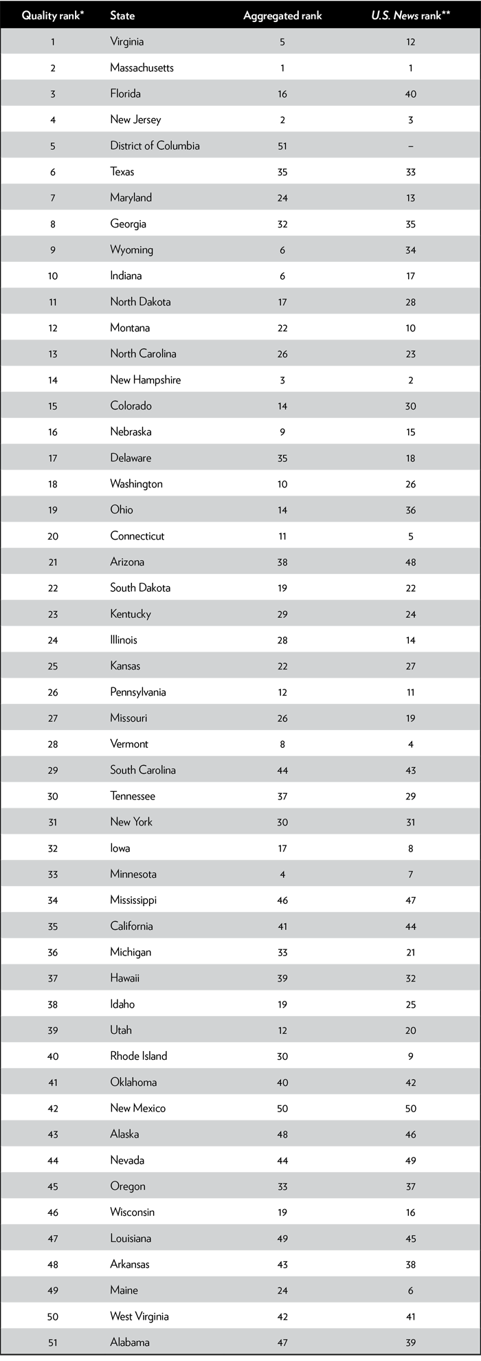
*Controls for heterogeneity; **Does not control for heterogeneity.
Source: National Center for Education Statistics, 2017 NAEP Mathematics and Reading Assessments, https://www.nationsreportcard.gov/reading_math_2017_highlights/.
The difference between the aggregated rankings and the U.S. News rankings shows the effect of U.S. News’ use of only partial NAEP data—no fourth grade or science scores—and the inclusion of factors unrelated to learning (e.g., graduation rates). The effects are substantial.
The difference between the disaggregated quality rank (first column) and the aggregated rank (third column) shows the effects of controlling for heterogeneity—our focus in this report—which are also substantial. States with small minority population shares (defined as Hispanic or black) tend to fall in the rankings when the data are disaggregated, and states with high shares of minority populations tend to rise when the data are disaggregated.
There are substantial differences between our quality rankings and the U.S. News rankings. For example, Maine drops from 6th in the U.S. News ranking to 49th in the quality ranking. Florida, which ranks 40th in U.S. News’, jumps to 3rd in our quality ranking.
Maine apparently does very well in the nonlearning components of U.S. News’ rankings; its aggregated NAEP scores would put it in 24th place, 18 positions lower than its U.S. News rank. But the aggregated NAEP scores overstate what its students have learned; Maine’s quality ranking is a full 25 positions below that. On the 10 achievement tests reported for Maine, its rankings on those tests are 46th, 45th, 48th, 37th, 41st, 40th, 34th, 40th, 41st, and 23rd. It is astounding that U.S. News could rank Maine as high as 6th, given the deficient performance of both its black and white students (the only two groups reported for Maine) relative to black and white students in other states. But since Maine’s student population is about 90 percent white, the aggregated scores bias the results upward.
On the other hand, Florida apparently scores poorly on U.S. News’ nonlearning attributes, since its aggregated NAEP scores (ranked 16th) are much better than its U.S. News score (ranked 40th). Florida’s student population is about 60 percent nonwhite, meaning that the aggregate scores are likely to underestimate Florida’s education quality, which is borne out by the quality ranking. In fact, Florida gets considerably above-average scores for all but one of its 24 reported tests, with student performance on half of its tests among the top five states, which is how it is able to earn a rank of 3rd in our quality rankings.20.
The decline in Maine’s ranking is representative of some other New England and midwestern states such as Vermont, New Hampshire, and Minnesota, which tend to have largely white populations, leading to misleadingly high positions in typical rankings such as U.S. News’. The increase in Florida’s ranking mirrors gains in the rankings of other southern and southwestern states, such as Texas and Georgia, with large minority populations. This leads to a serious distortion of beliefs about which parts of the country do a better job educating their students.
We should note that the District of Columbia, which is not ranked at all by U.S. News, does very well in our quality rankings. It is not surprising that D.C.’s disaggregated ranking is quite different from the aggregated ranking, given that D.C.’s population is about 85 percent minority. Nevertheless, we suspect that the very large change in rank is something of an aberration. D.C.’s high ranking is driven by the unusually outstanding scores of its white students, who come from disproportionately affluent and educated families,21. and whose scores were more than four standard deviations above the national white mean in each test subject they participated in (a greater difference than for any other single ethnic group in any state). Were it not for these scores, D.C. would be somewhat below average (with D.C. blacks slightly below the national black average and Hispanics considerably below their average).
Massachusetts and New Jersey, which are highly ranked by U.S. News, are also highly ranked by our methodology, indicating that they deserve their high rankings based on the performance of all their student groups. Other states have similar placements in both rankings. Overall, however, the correlation between our rankings and U.S. News’ rankings is only 0.35, which, while positive, does not evince a terribly strong relationship.
Failing to disaggregate student-performance data and inserting factors not related to learning distorts results. By construction, our measure better reflects the relative performance of each group of students in each state, as measured by the NAEP data. We believe the differences between our rankings and the conventional rankings warrant a serious reevaluation of which state education systems are doing the best jobs for their students; we hope the conventional ranking organizations will be prompted to make changes that more closely follow our methodology.
Examining the Efficiency of Education Expenditures
The overall quality of a school system is obviously of interest to educators, parents, and politicians. However, it’s also important to consider, on behalf of taxpayers, the amount of government expenditure undertaken to achieve a given level of success. For example, New York spends the most money per student ($22,232), almost twice as much as the typical state. Yet that massive expenditure results in a rank of only 31 in Table 1. Tennessee, on the other hand, achieves a similar level of success (ranked 30th) and spends only $8,739 per student. Although the two states appear to have education systems of similar quality, the citizens of Tennessee are getting far more bang for the buck.
To show the spending efficiency of a state’s school system, Figure 1 plots per student expenditures on the horizontal axis against student performance on the vertical axis. Notice that New York and Tennessee are at about the same height but that New York is much farther to the right.
Figure 1
Scatterplot of per pupil expenditures and average normalized NAEP test scores
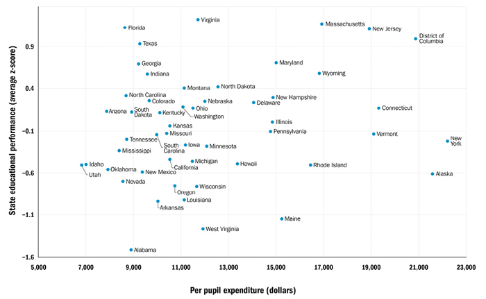
Source: National Center for Education Statistics, 2017 NAEP Mathematics and Reading Assessments, https://www.nationsreportcard.gov/reading_math_2017_highlights/.
The most efficient educational systems are seen in the upper-left corner of Figure 1, where systems are high quality and inexpensive. The least efficient systems are found in the lower right. From casual examination of Figure 1, it appears likely that some states are not using education funds efficiently.
Because spending values are nominal—that is, not adjusted for cost-of-living differences across states—using unadjusted spending figures might disadvantage high-cost states, in which above-average education costs may reflect price differences rather than more extravagent spending. For this reason, we also calculate a ranking based on education quality per adjusted dollar of expenditure, where the adjustment controls for statewide differences in the cost of living (COL).22. The COL-adjusted rankings are probably the rankings that best reflect how efficiently states are providing education. Adjusting for COL has a large effect on high-cost states such as Hawaii, California, and D.C. Table 2 presents two spending-efficiency rankings of states that capture how well their heterogeneous students do on NAEP exams in comparison to how much the state spends to achieve those rankings. These rankings are calculated by taking a slightly revised version of the state’s z-score and dividing it by the nominal dollar amount of educational expenditure or by the COL-adjusted educational expenditure made by the state.23. These adjustments lower the rank of states like New York, which spends a great deal for mediocre performance, and increase the rank of states like Tennessee, which achieves similar performance at a much lower cost. Massachusetts and New Jersey, which impart a good deal of knowledge to their students, do so in such a costly manner using nominal values that they fall out of the top 20, although Massachusetts, having a higher cost of living, remains in the top 20 when the cost of living adjustment is made. States like Idaho and Utah, which achieve only mediocre success in imparting knowledge to students, do it so inexpensively that they move up near the top 10.
Table 2
State rankings adjusted for student heterogeneity and expenditures
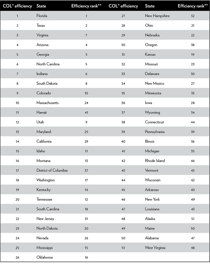
*COL = cost of living.
**Using nominal dollars.
Sources: National Center for Education Statistics, 2017 NAEP Mathematics and Reading Assessments, https://www.nationsreportcard.gov/reading_math_2017_highlights/; and Missouri Economic Research and Information Center, Cost of Living Data Series 2017 Annual Average, https://www.missourieconomy.org/indicators/cost_of_living.
The top of the efficiency ranking is dominated by states in the South and Southwest. This result is quite a difference from the traditional rankings.
The correlation between these spending efficiency rankings and the U.S. News rankings drops to –0.14 and –0.06 for the nominal and COL-adjusted efficiency rankings, respectively. This drop is not surprising since the rankings in Table 2 treat expenditures as something to be economized on, whereas the U.S. News rankings don’t consider K–12 expenditures at all (and other rankings consider higher expenditures purely as a plus factor). The correlations of the Table 1 quality rankings and Table 2 efficiency rankings, with nominal and adjusted expenditures, are 0.54 and 0.65, respectively. This indicates that accounting for the efficiency of expenditures substantially alters the rankings, although somewhat less so when the cost of living is adjusted for. This higher correlation for the COL rankings makes sense because high-cost states devoting the same share of resources as the typical state would be expected to spend above-average nominal dollars, and the COL adjustment reflects that.
Other Factors Possibly Related to Student Performance
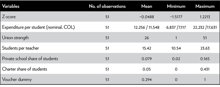
Our data allow us to make a brief analysis of some factors that might be related to student performance in states. Our candidate factors are expenditure per student (either nominal or COL adjusted), student-teacher ratios, the strength of teacher unions, the share of students in private schools, and the share in charter schools.24. The expenditure per student variable is considered in a quadratic form since diminishing marginal returns is a common expectation in economic theory.
Table 3 presents the summary statistics for these variables. The average z-score is close to zero, which is to be expected.25. Nominal expenditure per student ranges from $6,837 to $22,232, with the COL-adjusted values having a somewhat smaller range. The union strength variable is merely a ranking from 1 to 51, with 51 being the state with the most powerful union effect. The number of students per teacher ranges from a low of 10.54 to a high of 23.63. The other variables are self-explanatory.
Table 3
Summary statistics
Sources: National Center for Education Statistics, 2017 NAEP Mathematics and Reading Assessments, https://www.nationsreportcard.gov/reading_math_2017_highlights/; Missouri Economic Research and Information Center, Cost of Living Data Series 2017 Annual Average, https://www.missourieconomy.org/indicators/cost_of_living; National Center for Education Statistics, Digest of Education Statistics: 2017, Table 236.65, https://nces.ed.gov/programs/digest/d17/tables/dt17_236.65.asp?current=yes; Amber M. Winkler, Janie Scull, and Dara Zeehandelaar, “How Strong are Teacher Unions? A State-By-State Comparison,” Thomas B. Fordham Institute and Education Reform Now, 2012; Digest of Education Statistics: 2017, Table 208.40, https://nces.ed.gov/programs/digest/d17/tables/dt17_208.40.asp?current=yes; National Center for Education Statistics, Private School Universe Survey, https://nces.ed.gov/surveys/pss/; charter school share determined by dividing the total enrollment in charter schools by the total enrollment in all public schools for each state, Digest of Education Statistics: 2017, Table 216.90, https://nces.ed.gov/programs/digest/d17/tables/dt17_216.90.asp?current=yes, and Digest of Education Statistics: 2016, Table 203.20, https://nces.ed.gov/programs/digest/d16/tables/dt16_203.20.asp.; and Education Commission of the States, “50-State Comparison: Vouchers,” March 6, 2017, http://www.ecs.org/50-state-comparison-vouchers/.
We use multiple regression analysis to measure the relationship between these variables and our (dependent) variable—the average z-scores drawn from state NAEP test scores in the 24 categories mentioned above. Regression analysis can show how variables are related to one another but cannot demonstrate whether there is causality between a pair of variables where changes in one variable lead to changes in another variable.
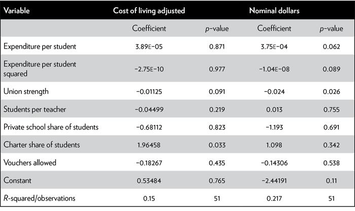
Table 4 provides the regression results using COL expenditures (results on the left) or using nominal expenditures (results on the right). To save space, we only include the coefficients and p-values, the latter of which, when subtracted from one, provides statistical confidence levels. Those coefficients for variables that were statistically significant are marked with asterisks (one asterisk indicates a 90 percent confidence level and two a level of 95 percent).
Table 4
Multiple regression results explaining quality of education
Sources: National Center for Education Statistics, 2017 NAEP Mathematics and Reading Assessments, https://www.nationsreportcard.gov/reading_math_2017_highlights/; Missouri Economic Research and Information Center, Cost of Living Data Series 2017 Annual Average, https://www.missourieconomy.org/indicators/cost_of_living; National Center for Education Statistics, Digest of Education Statistics: 2017, Table 236.65, https://nces.ed.gov/programs/digest/d17/tables/dt17_236.65.asp?current=yes; Amber M. Winkler, Janie Scull, and Dara Zeehandelaar, “How Strong are Teacher Unions? A State-By-State Comparison,” Thomas B. Fordham Institute and Education Reform Now, 2012; Digest of Education Statistics: 2017, Table 208.40, https://nces.ed.gov/programs/digest/d17/tables/dt17_208.40.asp?current=yes; National Center for Education Statistics, Private School Universe Survey, https://nces.ed.gov/surveys/pss/; charter school share determined by dividing the total enrollment in charter schools by the total enrollment in all public schools for each state, Digest of Education Statistics: 2017, Table 216.90, https://nces.ed.gov/programs/digest/d17/tables/dt17_216.90.asp?current=yes, and Digest of Education Statistics: 2016, Table 203.20, https://nces.ed.gov/programs/digest/d16/tables/dt16_203.20.asp.; and Education Commission of the States, “50-State Comparison: Vouchers,” March 6, 2017, http://www.ecs.org/50-state-comparison-vouchers/.
The choice of nominal vs. COL expenditures leads to a large difference in the results. The COL-adjusted results are likely to lead to a greater number of correct conclusions.
Nominal expenditures per student are related in a positive and statistically significant manner to student performance up to a point, but the positive effect of expenditures per student declines as expenditures per student increase. The coefficients on the two expenditure-per-student variables indicate that additional nominal spending is no longer related to performance when nominal spending gets to a level of $18,500 per student, a level that is exceeded by only a handful of states.26. The predicted decline in student performance for the few states exceeding the $18,500 limit, assuming causality from spending to performance, is quite small (approximately two rank positions for the state with the largest expenditure),27. so that this evidence is best interpreted as supporting a view that the states with the highest spending have reached a saturation point beyond which no more gains can be made.28.
Using COL-adjusted values, however, starkly changes results. With COL values, no significant relationship is found between spending and student performance, either in magnitude or statistical significance. This does not necessarily imply that spending overall has no effect on outcomes (assuming causality), but merely that most states have reached a sufficient level of spending such that additional spending does not appear to be related to achievement as measured by these test scores. This is a different conclusion from that based on nominal expenditures. These different results imply that care must be taken, not just to ensure that achievement test scores are disaggregated in analyses of educational performance, but also that if expenditures are used in such analyses, they are adjusted for cost of living differentials.
The union strength variable in Table 4 has a substantial and statistically significant negative relationship with student achievement. The coefficient in the nominal expenditure regressions suggests a relationship such that if a state went from having the weakest unions to the strongest unions, holding the other education factors constant, that state would have a decrease in its z-score of over 1.22 (0.024 × 51). To put this in perspective, note in Table 3 that the z-scores vary from a high of 1.22 to a low of –1.51, a range of 2.73. Thus, the shift from weakest to strongest unions would move a state down about 45 percent of the way through this total range, or equivalently, alter the rank of the state by about 23 positions.29. This is a dramatic result. The COL regressions also show a large relationship, but it is only about half the magnitude of the coefficient in the nominal expenditure regressions. This negative relationship suggests an obvious interpretation. It is well known that teachers’ unions aim to increase wages for their members, which may increase student performance if higher quality teachers are drawn to the higher salaries. Such a hypothesis is inconsistent with the finding here, which is instead consistent with the view that unions are negatively related to student performance, presumably by opposing the removal of underperforming teachers, opposing merit-based pay, or because of union work rules. While much of the empirical literature finds positive relationships between unionization and student performance, studies that most effectively control for heterogeneous student populations, as we have, tend to find more negative relationships, such as those found here.30.
Our results also indicate that having a greater share of students in charter schools is positively related to student achievement, with the result being statistically significant in the COL regressions but not in the nominal expenditure regressions. The size of the relationship is fairly small, however, indicating, if the relationship were causal, that when a state increases its share of students in charter schools from 0 to 50 percent (slightly above the level of the highest observation) it would be expected to have an increase in rank of only 0.9 positions (0.5 × 1.8) in the COL regression and about half of that in the nominal expenditure regressions (where the coefficient is not statistically significant).31. Given that there is great heterogeneity in charter schools both within and between states, it is not surprising that our rather simple statistical approach does not find much of a relationship.
We also find that the share of students in private schools has a small negative relationship with the performance of students in public schools, but the level of statistical confidence is far too low for these results to be given any credence. (Although private school students take the NAEP exam, the NAEP data we use are based only on public school students.) Similarly, the existence of vouchers appears to have a negative relationship to achievement, but the high p-values tell us we cannot have confidence in those results.
There is some slight evidence, based on the COL regression, that higher student-teacher ratios have a small negative relationship with student performance, but the level of statistical confidence is below normally accepted levels. Though having more students per teacher is theorized to be negatively related to student performance, the empirical literature largely fails to find consistent effects of student-teacher ratios and class size on student performance.32. We should not be too surprised that student-teacher ratios do not appear to have a clear relationship with learning since the student-teacher ratios used here are aggregated for entire states, merging together many different classrooms in elementary, middle, and high schools.
Some Limitations
Although this study constitutes a significant improvement on leading state education rankings, it retains some of their limitations.
If the makers of state education rankings were to be frank, they would acknowledge that the entire enterprise of ranking state-level systems is only a blunt instrument for judging school quality. There exists substantial variation in educational quality within states. Schools differ from district to district and within districts. We generally dislike the idea of painting the performance of all schools in a given state with the same brush. However, state-level rankings do provide an intuitively pleasing basis for lawmakers and interested citizens to compare state education policies. Because state rankings currently play such a prominent role in the public debate on education policy, their more glaring methodological defects detailed above demand rectification. Any state ranking is nonetheless limited by aggregation inherent at the state-level unit of analysis.
Another limitation to our study, common to virtually all state education rankings, is that we treat the result of education as a one-dimensional variable. Of course, educational results are multifaceted and more complex than a single measure could capture. A standardized test may not pick up potentially important qualities such as creativity, critical thinking, or grit. Part of the problem is that there is no accepted measurement of those attributes.
We also are using a data snapshot that reflects measures of learning at a particular moment in time. However, the performance of students at any grade level depends on their education at all prior grade levels. A ranking of states based on student performance is the culmination of learning over a lengthy time period. An implicit assumption in creating such rankings is that the quality of various school systems changes slowly enough for a snapshot in one year to convey meaningful information about the school system as it exists over the entire interval in which learning occurred. This assumption allows us to attribute current or recent student performance, which is largely based on past years of teaching, to the teaching quality currently found in these schools. This assumption is present in most state rankings but may obscure sudden and significant improvement, or deterioration, in student knowledge that occurs in discrete years.
Conclusions
While the state level may be too aggregated a unit of analysis for the optimal examination of educational outcomes, state rankings are frequently used and discussed. Whether based appropriately on learning outcomes or inappropriately on nonlearning factors, comparisons between states greatly influence the public discourse on education. When these rankings fail to account for the heterogeneity of student populations, however, they skew results in favor of states with fewer socioeconomically challenged students.
Our ranking corrects these problems by focusing on outputs and the value added to each of the demographic groups the state education system serves. Furthermore, we consider the cost-effectiveness of education spending in U.S. states. States that spend efficiently should be recognized as more successful than states paying larger sums for similar or worse outcomes.
Adjusting for the heterogeneity of students has a powerful effect on the assessments of how well states educate their students. Certain southern and western states, such as Florida and Texas, have much better student performances than appears to be the case when student heterogeneity is not taken into account. Other states, such as Maine and Rhode Island in New England, fall substantially. These results run counter to conventional wisdom that the best education is found in northern and eastern states with powerful unions and high expenditures.
This difference is even more pronounced when spending efficiency, a factor generally neglected in conventional rankings, is taken into account. Florida, Texas, and Virginia are seen to be the most efficient in terms of quality achieved per COL-adjusted dollar spent. Conversely, West Virginia, Alabama, and Maine are the least efficient. Some states that do an excellent job educating students, such as Massachusetts and New Jersey, also spend quite lavishly and thus fall considerably when spending efficiency is considered.
Finally, we examine some factors thought to influence student performance. We find evidence that state spending appears to have reached a point of zero returns and that unionization is negatively related to student performance, and some evidence that charter schools may have a small positive relationship to student achievement. We find little evidence that class size, vouchers, or the share of students in private schools have measurable effects on state performance.
Which state education systems are worth emulating and which are not? The conventional answer to this question deserves to be reevaluated in light of the results presented in this report. We hope that our rankings will better inform pundits, policymakers, and activists as they seek to improve K–12 education.
Appendix
Conventional education-ranking methodologies based on NAEP achievement tests are likely to skew results. In this Appendix, we provide a simple example of how and why that happens.
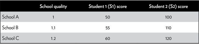
Our example assumes two types of students and three types of schools (or state school systems). The two columns on the right in appendix Table 1 denote different types of student, and each row represents a different school. School B is assumed to be 10 percent better than School A, and School C is assumed to be 20 percent better than School A, regardless of the student type being educated.
There are two types of students; S2 students are better prepared than S1 students. Students of the same type score differently on standard exams depending on which school they are in, but the two student types also perform differently from each other no matter which school they attend. Depending on the proportions of each type of student in a given school, a school’s rank may vary substantially if the wrong methodology is used.
Table 1
Example of students and scores
Source: Author calculations.
An informative ranking should reflect each school’s relative performance, and the scores on which the rankings are based should reflect the 10 percent difference between School A and School B, and the 20 percent difference between School A and School C. Obviously, a reliable ranking mechanism should place School A in 3rd place, B in 2nd, and C in 1st.
However, problems arise for the typical ranking procedure when schools have different proportions of student types. The appendix Table 2 shows results from a typical ranking procedure under two different population scenarios.
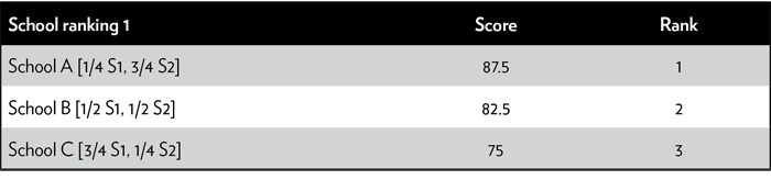
School ranking 1 shows what happens when 75 percent of School A’s students are type S2 and 25 percent are type S1; School B’s students are split 50-50 between types S1 and S2; and School C’s students are 75 percent type S1 and 25 percent type S2.33.
Because School A has a disproportionately large share of the stronger S2 students, it scores above the other two schools even though School A is the weakest school. Ranking 1 completely inverts the correct ranking of schools. This example, detailed in appendix Table 2, demonstrates how rankings that do not take the heterogeneity of students and the proportions of each type of student in each school into account can give entirely misleading results.
Table 2
Rankings not accounting for heterogeneity
Source: Author calculations.
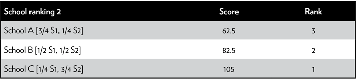
Conversely, school ranking 2 reverses the student populations of schools A and C. School C now also has more of the strongest students. The rankings are correctly ordered, but the underlying data used for the rankings greatly exaggerate the superiority of School C. Comparing the scores of the three schools, School B appears to be 32 percent better than School A and School C appears to be 68 percent better than School A, even though we know (by construction) that the correct values are 10 percent and 20 percent, respectively. School ranking 2 only happens to get the order right because there are no intermediary schools whose rankings would be improperly altered by the exaggerated scores of schools A and C in ranking 2.
The ranking methodology used in this paper, by contrast, compares each school for each type of student separately. It measures quality by looking at the numbers in appendix Table 1 and noting that each type of student at School B scores 10 percent higher than the same type of student at School A, and each type of student at School C scores 20 percent higher than the same type of student at School A. That is what makes our methodology conceptually superior to prior methodologies.
If all schools happened to have the same share of different types of students, a possibility not shown in appendix Table 2, the conventional ranking methodology used by U.S. News would work as well as our rankings. But our analysis in this paper has shown that schools and school systems in the real world have very different student populations, which is why our rankings differ so much from previous rankings. Our general methodology isn’t just hypothetically better under certain demographic assumptions; rather, it is better under any and all demographic circumstances.
Notes
1. “Pre-K–12 Education Rankings: Measuring How Well States Are Preparing Students for College,” U.S. News & World Report, May 18, 2018, https://www.usnews.com/news/best-states/rankings/education/preK–12. Others include those by Wallet Hub, Education Week, and the American Legislative Exchange Council.
2. Govs. Phil Murphy of New Jersey and Greg Abbott of Texas recently sparred over the virtues and vices of their state business climates, including their education systems, in a pair of newspaper articles. Greg Abbott, “Hey, Jersey, Don’t Move to Fla. to Avoid High Taxes, Come to Texas. Love, Gov. Abbott,” Star-Ledger, April 17 2018, http://www.nj.com/opinion/index.ssf/2018/04/hey_jersey_dont_move_to_fla_to_avoid_high_taxes_co.html; and Phil Murphy, “NJ Gov. Murphy to Texas Gov. Abbott: Back Off from Our People and Companies,” Dallas Morning News, April 18, 2018, https://www.dallasnews.com/opinion/commentary/2018/04/18/nj-gov-murphy-texas-gov-abbott-back-people-companies.
3. Bryce Covert, “Oklahoma Teachers Strike for a 4th Day to Protest Rock-Bottom Education Funding,” Nation, April 5, 2018.
4. We are aware of an earlier discussion by Dave Burge in a March 2, 2011, posting on his “Iowahawk” blog, discussing the mismatch between state K–12 rankings with and without accounting for heterogeneous student populations, http://iowahawk.typepad.com/iowahawk/2011/03/longhorns-17-badgers-1.html. A 2015 report by Matthew M. Chingos, “Breaking the Curve,” https://www.urban.org/research/publication/breaking-curve-promises-and-pitfalls-using-naep-data-assess-state-role-student-achievement, published by the Urban Institute, is a more complete discussion of the problems of aggregation and presents on a separate webpage updated rankings of states that are similar to ours, but it does not discuss the nature of the differences between its rankings and the more traditional rankings. Chingos uses more controls than just ethnicity, but the extra controls have only minor effects on the rankings. He also uses the more complete “restricted use” data set from the National Assessment of Education Progress (NAEP), whereas we use the less complete but more readily available public NAEP data. One advantage of our analysis, in a society obsessed with STEM proficiency, is that we use the science test in addition to math and reading, whereas Chingos only uses math and reading.
5. For a recent example of the spending hypothesis see Paul Krugman, “We Don’t Need No Education,” New York Times, April 23, 2018. Krugman approvingly cites California and New York as positive examples of states that have considerably raised teacher pay over the last two decades, implying that such states would do a better job educating students. As noted in this paper, both states rank below average in educating their students.
6. We assume, as do other rankings that use NAEP data, that the NAEP tests assess student performance on material that students should be learning and therefore reflect the success of a school system in educating its students. It is of course possible that standardized tests do not correctly measure educational success. This would be a particular problem if some schools alter their teaching to focus on doing well on those tests while other schools do not. We think this is less of a problem for NAEP tests because most grades and most teachers are not included in the sample, meaning that when teacher pay and school funding are tied to performance on standardized tests, they will be tied to tests other than NAEP.
7. Since 1969, the NAEP test has been administered by the National Center for Education Statistics within the U.S. Department of Education. Results are released annually as “the nation’s report card.” Tests in several subjects are administered to 4th, 8th, and sometimes 12th graders. Not every state is given every test in every year, but all states take the math and reading tests at least every two years. The National Assessment Governing Board determines which test subjects will be administered each year. In the analysis below, we use the most recent data for math and reading tests, from 2017, and the science test is from 2015. NAEP tests are not given to every student in every state, but rather, results are drawn from a sample. Tests are given to a sample of students within each jurisdiction, selected at random from schools chosen so as to reflect the overall demographic and socioeconomic characteristics of the jurisdiction. Roughly 20–40 students are tested from each selected school. In a combined national and state sample, there are approximately 3,000 students per participating jurisdiction from approximately 100 schools. NAEP 8th grade test scores are a component of U.S. News’ state K–12 education rankings, but are highly aggregated.
8. As direct measures of student learning for the entire student body, NAEP scores should form the basis of any state rankings of education. Nevertheless, rankings such as U.S. News’ include not only NAEP scores, but other variables that do not measure learning, such as graduation rates, pre-K education quality/enrollment, and ACT/SAT scores, which measure learning but are not, in many cases, taken by all students in a state and are likely to be highly correlated with NAEP scores. We believe that these other measures do not belong in a ranking of state education quality.
9. “Quality Counts 2018: Grading the States,” Education Week, January 2018, https://www.edweek.org/ew/collections/quality-counts-2018-state-grades/index.html. The three broad components used in this ranking include “chance for success,” “state finances,” and “K–12 achievement.”
10. Informed by such rankings, it’s no wonder the public debate on education typically assumes more spending is always better, even in the absence of corresponding improvements in student outcomes.
11. NAEP data also include scores for the ethnic categories “American Indian/Native Alaskan,” and “Two or More.” However, too few states had sufficient data for these scores to be a reliable indicator of the performance of these groups in that state. These populations are small enough in number to exclude from our analysis.
12. Not all states give all the tests (e.g., science test) to their students. While every state must have students take the math and reading tests at least every two years, the National Assessment Governing Board determines which other tests will be given to which states.
13. Because Iowa lacks enough Asian fourth and eighth grade students to provide a reliable average from the NAEP sample, NAEP does not have scores for Asian fourth graders in any subject or Asian eighth graders in science. This lowers the number of possible tests in Iowa from 24 to 20.
14. Our rankings assume that students in each ethnic group are similar across states. Although this assumption may not always be correct, it is more realistic than the assumption made in other rankings that the entire student population is similar across states.
15. For example, Washington, Utah, North Dakota, New Hampshire, Nebraska, and Minnesota also shut out Texas on all six tests (math, reading, science, 4th and 8th grades) under the assumption of homogeneous student populations. Nevertheless, Texas dominates all these states when comparisons are made using the full set of 24 exams that allow for student heterogeneity. Six states change by more than 24 positions depending on whether they are ranked using aggregated or disaggregated NAEP scores.
16. There are other categories in the NAEP data not directly related to race. Several of these (e.g., disability status, English language learner status, gender) have only minuscule effects on rankings and thus are ignored in our analysis. Among these nonracial factors, the most important is whether the student qualifies for subsidized school lunches, a proxy for family income. We do not include this variable in our analysis because the income requirements determining which students qualify for subsidized lunches are the same for all states in the contiguous United States, despite considerable differences in cost of living between jurisdictions. High cost of living states can have costs 85 percent higher than low cost of living states. High cost of living states will have fewer students qualify for subsidized lunches, and low cost of living states will have more students qualify than would be the case if cost of living adjustments were made. Because the distribution of cost of living values across states is not symmetrical, the difference in scores between students with subsidized lunches and students without, across states, is likely to be biased. This bias is pertinent to our examination of state education systems and student performance, so we exclude it from our analysis. Its inclusion would only have had a minor effect on our rankings, however, since the correlation between a state ranking that includes this variable (at half the importance of the four equally weighted ethnicity variables) with one that excludes it is 0.92. A different nonracial variable is the parents’ education level, but this variable has the deficiency of only being available for eighth grade and not fourth grade students.
17. While we would have preferred to include test scores for 12th grade students, the data were not sufficiently complete to do so. While the NAEP test is given to 12th graders, it was only given to a national sample of students in 2015, and the most recent state averages available are from 2013. Even these 2013 state averages did not have a sufficient number of students from many of the ethnic groups we consider, and many states lacked a large number of observations. Because of the relatively incomplete data for 12th graders, we chose to include only 4th and 8th grade test scores. Note that U.S. News only includes state averages for 8th grade math and reading tests in their rankings.
18. When states do not report scores for each of the 24 NAEP categories, those states have their average scores calculated based on the exams that are reported.
19. We equate the importance of each of the 24 tests by forming, for each of the 24 possible exams, a z-score for each state, under the assumption that these state test scores have a normal distribution. The z-statistic for each observation is the difference between a particular state’s test score and the average score for all states, divided by the standard deviation of those scores over the states. Our overall ranking is merely the average z-score for each state. Thus, exams with greater variations or higher or lower mean scores do not have greater weight than any other test in our sample. The z-score measures how many standard deviations a state is above or below the mean score calculated over all states. One might argue that we should use an average weighted by the share of students, but we choose to give each group equal importance. If we had used population weights, the rankings would not have changed very much because the correlation between the two sets of scores is 0.86, and four of the top-five and four of the bottom-five states remain the same.
20. Without listing all of Florida’s 24 scores, its lowest 5 (out of the 51 states, in reverse order) are ranked 27, 21, 20, 19, and 10. The rest are all ranked in the top 10, with 12 of Florida’s test scores among the top 5 states.
21. Some 89 percent are college educated. See for example, David Alpert, “DC Has Almost No White Residents without College Degrees,” GGW.org, August 29, 2016, https://ggwash.org/view/42563/dc-has-almost-no-white-residents-without-college-degrees-its-a-different-story-for-black-residents.
22. The statewide cost of living adjustments are taken from the Missouri Economic Research and Information Center’s Cost of Living Data Series 2017 Annual Average, https://www.missourieconomy.org/indicators/cost_of_living.
23. It would be a mistake to use straightforward z-scores from Table 1 when constructing the “z-Score/$” variable because states with z-scores near zero and thus near one another would hardly differ even if their expenditures per student were very different. Instead, we added 2.50 to each z-score so that all states have positive z-scores and the lowest state would have a revised z-score of 1. We then divided each state’s revised z-score by the expenditure per student to arrive at the values shown in Table 2.
24. Data on expenditures, student-teacher ratios, and share of students in charter schools are taken from the National Center for Education Statistics’ Digest of Education Statistics. Data on share of students in private schools come from the NCES’s Private School Universe Survey. Our variable for unionization is a 2012 ranking of states constructed by researchers at the Thomas B. Fordham Institute, an education research organization, that used 37 different variables in five broad categories (Resources and Membership, Involvement in Politics, Scope in Bargaining, State Policies, and Perceived Influence). The ranking can be found in Amber M. Winkler, Janie Scull, and Dara Zeehandelaar, “How Strong Are Teacher Unions? A State-By-State Comparison,” Thomas B. Fordham Institute and Education Reform Now, 2012, https://edexcellence.net/publications/how-strong-are-us-teacher-unions.html.
25. Because many states had results for fewer than 24 exams, giving each state equal weight in the overall average would not provide the zero “average” that would be expected if the average of every z-score were used to form the average. There were also some rounding errors.
26. New Jersey, Vermont, Connecticut, Washington, D.C., Alaska, and New York all exceed this level.
27. The decline is 0.15 z-units, which is about 5 percent of the total z-score range.
28. We should also note that efficient use of money requires that it be spent up until the point where the marginal value of the benefits is less than the marginal expenditure. Thus, the point where increasing expenditures provides no additional value cannot be the efficient level of expenditure. Instead, the efficient level of expenditure must lie below that amount.
29. This is a somewhat rough approximation because the ranks form a uniform distribution and the z-scores form a normal distribution with the mass of observations near the mean. A movement of a given z-distance will change ranks more if the movement occurs near the mean than if the movement occurs near the tails.
30. For a review of the literature on unionization and student performance, see Joshua M. Cowen and Katharine O. Strunk, “The Impact of Teachers’ Unions on Educational Outcomes: What We Know and What We Need to Learn,” Economics of Education Review 48 (2015): 208–23. Earlier studies found positive effects of unionization, but recent studies are more mixed. Most researchers agree that unionization likely affects different types of students differently. For studies that find unionization negatively affects student performance, see Caroline Minter Hoxby, “How Teachers’ Unions Affect Education Production,” Quarterly Journal of Economics 111, no. 3 (1996): 671–718, https://doi.org/10.2307/2946669; and Geeta Kingdom and Francis Teal, “Teacher Unions, Teacher Pay and Student Performance in India: A Pupil Fixed Effects Approach,” Journal of Development Economics 91, no. 2 (2010): 278–88, https://doi.org/10.1016/j. jdeveco.2009.09.001 For studies that find no effect of unionization, see Michael F. Lovenheim, “The Effect of Teachers’ Unions on Education Production: Evidence from Union Election Certifications in Three Midwestern States,” Journal of Labor Economics 27, no. 4 (2009): 525–87, https://doi.org/10.1086/605653. More recently, only very small negative effects on student performance were found in Bradley D. Mariano and Katharine O. Strunk, “The Bad End of the Bargain? Revisiting the Relationship between Collective Bargaining Agreements and Student Achievement,” Economics of Education Review 65 (2018): 93–106, https://doi.org/10.1016/j.econedurev.2018.04.006.
31. To arrive at this value, we multiply the coefficient (1.96) by 50 percent to determine the change in z-score and then divide by 2.73, the range of z-scores among the states. This provides a value of 35.5 percent, indicating how much of the range in z-scores would be traversed as a result of the change in charter school students. This value is then multiplied by 51 states in the analysis.
32. For a discussion on the empirical literature regarding school class size, see Edward P. Lazear, “Educational Production,” Quarterly Journal of Economics 116, no. 3 (2001): 777–803, https://doi.org/10.1162/00335530152466232. Lazear suggests that differing student and teacher characteristics make it difficult to isolate the effect of class size on student outcomes. This view, although spun in a more positive light, generally is supported in a more recent summary of the academic literature found in Grover J. Whitehurst and Matthew M. Chingos, “Class Size: What Research Says and Why It Matters for State Policy,” Brown Center on Education Policy, Brookings Institution, May 2011, https://www.brookings.edu/research/class-size-what-research-says-and-what-it-means-for-state-policy/.
33. The score column in appendix Table 2 merely multiplies the score for each type of student at a school by the share of the student type in the school population and sums the amounts. For example, the 87.5 value for School A in ranking 1 is found by multiplying the S1 score of 50 by .25 (=12.5) and adding that to the product of the population share of S2 (0.75) and the S2 score of 100 (=75) in School A. This method is effectively what U.S. News and other conventional rankings use.